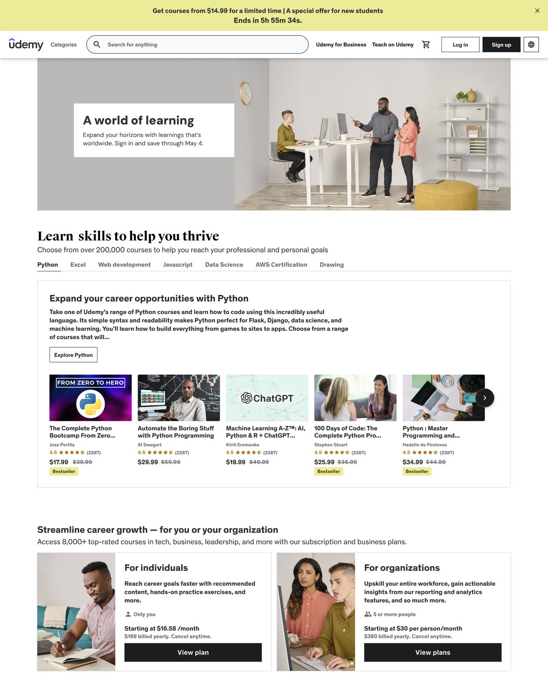
A crowded course store
Endless rows of courses and no sense of where to start.
 Hover to scroll

Udemy ran two homepages, one for learners and one for businesses, and neither was working. I led the redesign that merged them into one page that works for both.
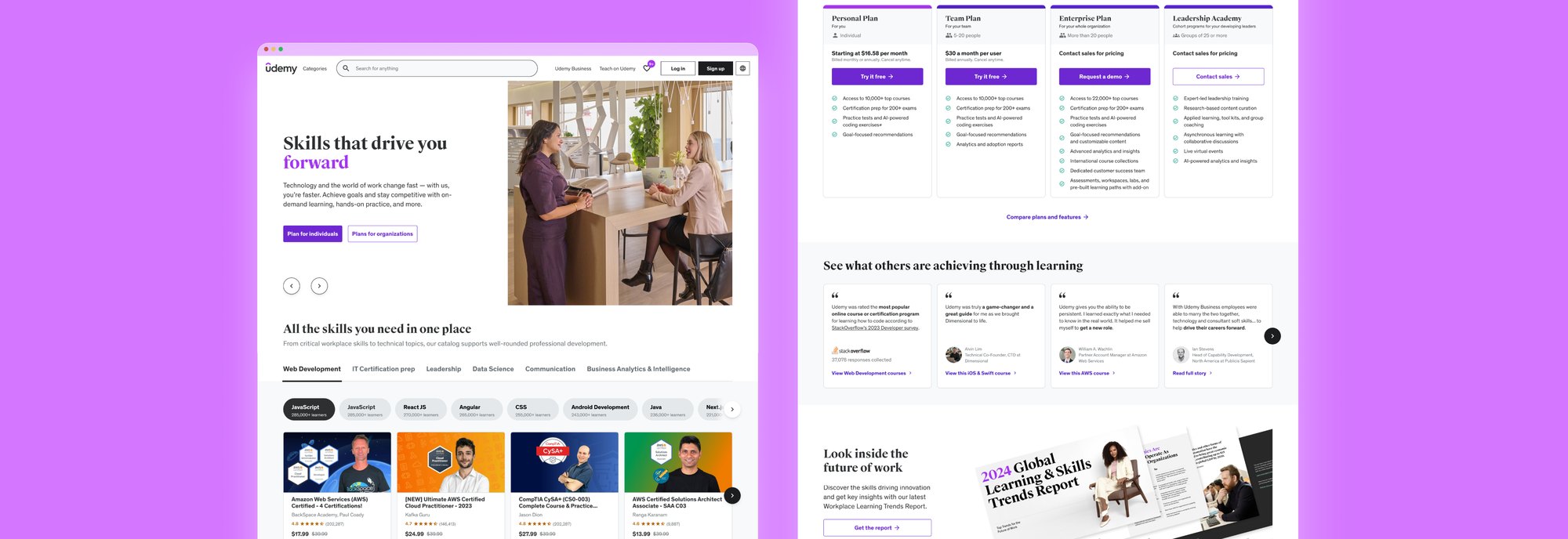
Udemy ran two homepages, one for learners and one for businesses, and most visitors didn’t get what Udemy offered.
As the sole designer, I took the redesign from research to global launch, merging both pages into one modular homepage that works for both audiences.
Both pages were built to sell courses, and did little to help people figure out what to learn.
Endless rows of courses and no sense of where to start.
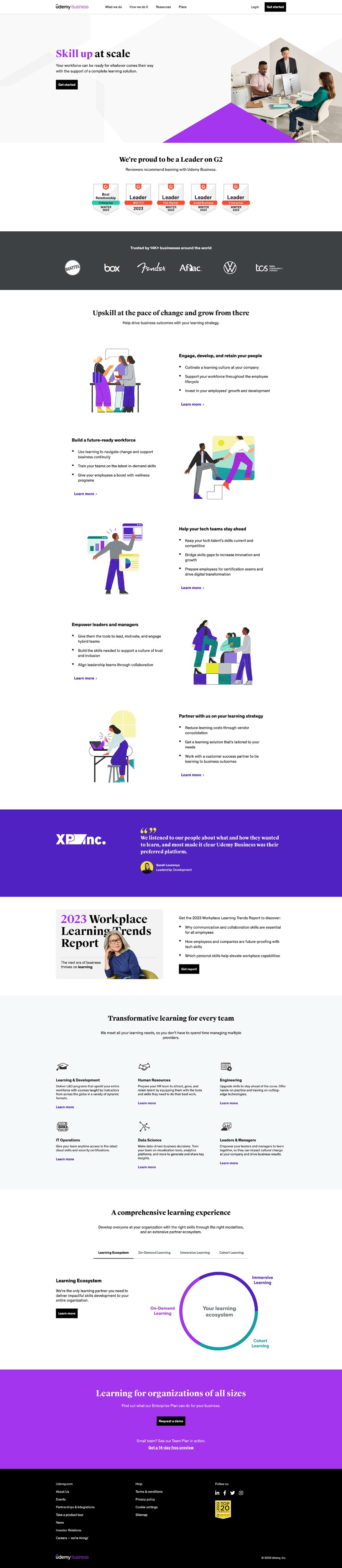
Hover to scrollMostly long paragraphs. Buyers couldn’t find proof that Udemy would actually help their team.
 Hover to scroll
Turn a crowded course marketplace into a learning platform that learners can find their way around and buyers can trust?
 Sia, the roleless learnerFresh out of school or switching careers
“My job is fine. I just can’t find one that feels right for me.”
Sia doesn’t know which skills will lead to a job, and the old page only showed a catalog.
 Joash, the skeptical buyerChoosing training for a team
“I see a lot of text, but I don’t see proof. Why should I trust this for my employees?”
Joash needs evidence to show leadership before spending budget on training.
We turned each problem from research into a goal.
Lean on visuals, data, and real examples, which get the point across faster than long copy.
Point learners and buyers to the right path from the first click, without using any personal data.
Spread proof through the page, like partner logos, learner reviews, and results from real companies.
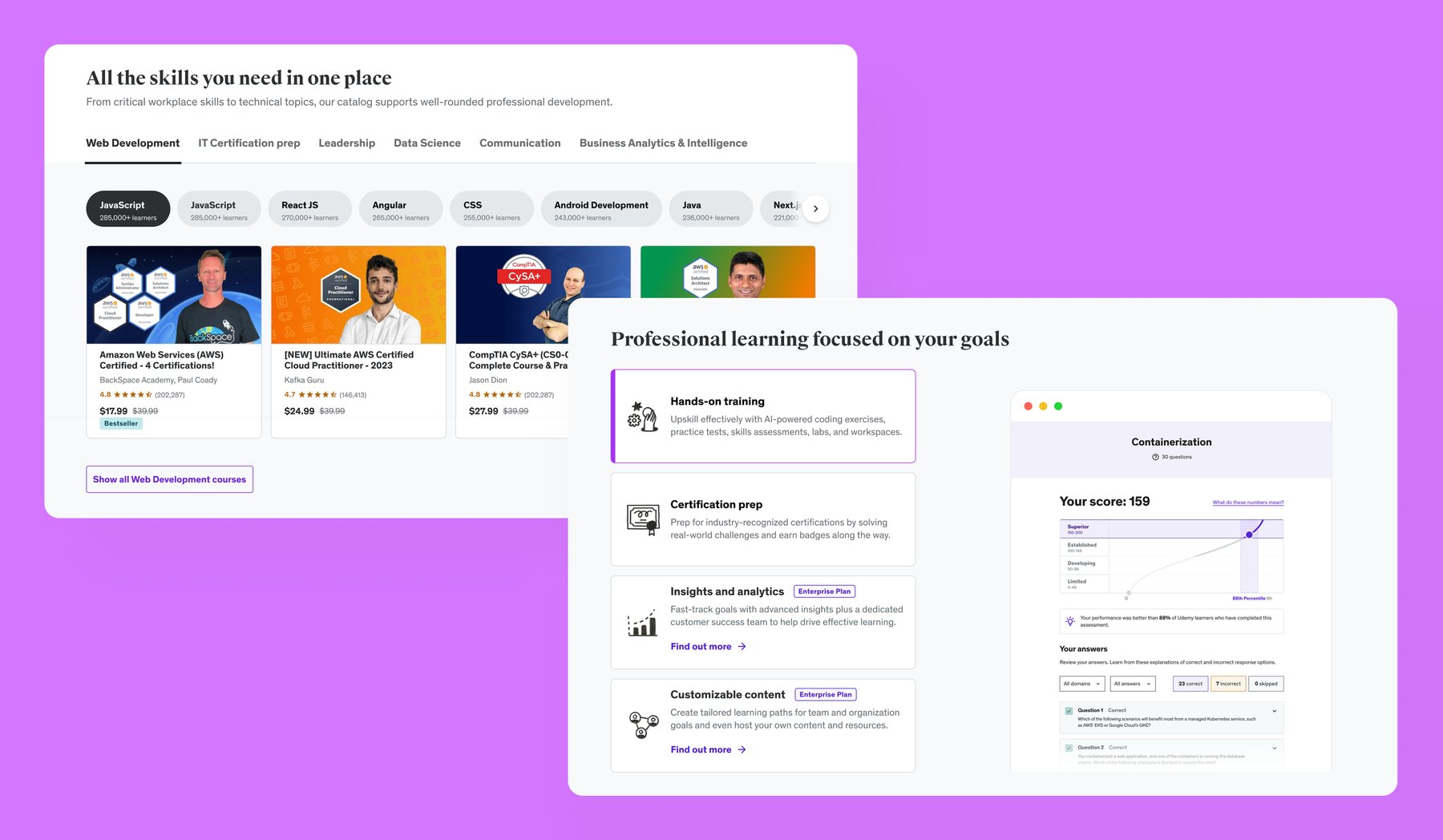
A card-based system each region can reorder around its own priorities, so 18 markets share one design. I added the new components to Udemy’s design system.
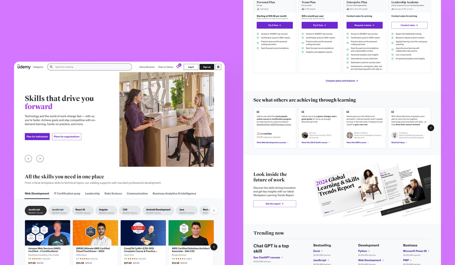
New headline modules and learner stories show what people actually got out of their courses.
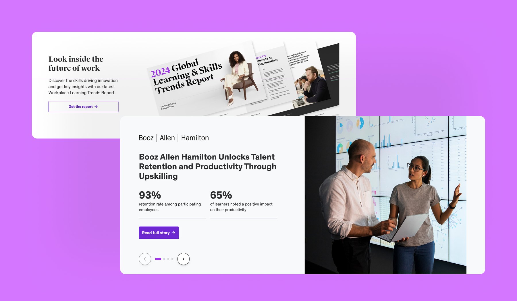
Reports, case studies, and customer results give decision-makers evidence they can share with their team.
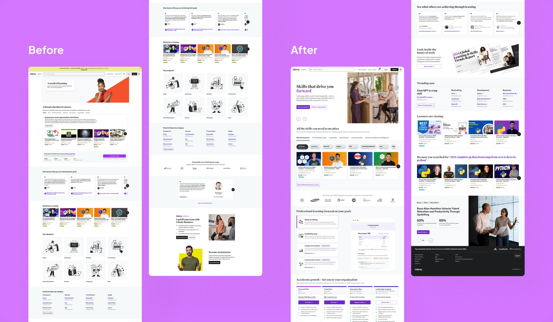
I put two versions of the course browsing module in front of users. Version B won, and their feedback shaped the final one.
Lots of low-fi sketches, and a content strategy worked out with product marketing and a copywriter.
I gathered 40+ benchmarks and past research reports and ran a design workshop with the team.
Preference tests, message tests, and phased A/B tests before the global rollout.
She has been a key contributor for many hugely impactful projects. She is curious, a deep thinker and an active contributor to our work… Her collaborative spirit is invaluable, and her well-explored and thoughtful design solutions and approaches demonstrate that she is a keen advocate for our users.
 Pilar Strutin-BelinoffSenior Design Director, Udemy
With 18 markets, the real work was the set of blocks each team could rearrange. The new components were later added to Udemy’s design system.
Working closely with engineering showed me how much page performance shapes behavior, so I treated it as part of the design.
Once the page told one clear story for both learners and buyers, brand, performance, and business goals stopped competing.